Launch Images and Splash Screens
An app’s launch image (aka Default.png) is displayed when an app loads from a terminated state. The original idea of the launch image was to quickly throw a bitmap of the interface on the screen - minus any interactive elements - in order to give the user the impression that that the app was loading faster than it really was. Here are a few examples of apps the follow Apple’s advice: What’s App, Dropbox, Vine, Sunrise, and Things.

But many apps aren’t bothering with the bare UI launch image anymore. I can think of a few reasons:
- Faster devices mean less load time, so you the fast-loading illusion isn’t required
- It’s a huge hassle to make the bare UI images - particularly if you need to supporting both iOS 6 and 7 or if your app supports both iPad and iPhone
- The non-interactive UI that Apple recommends looks bleak – almost spooky
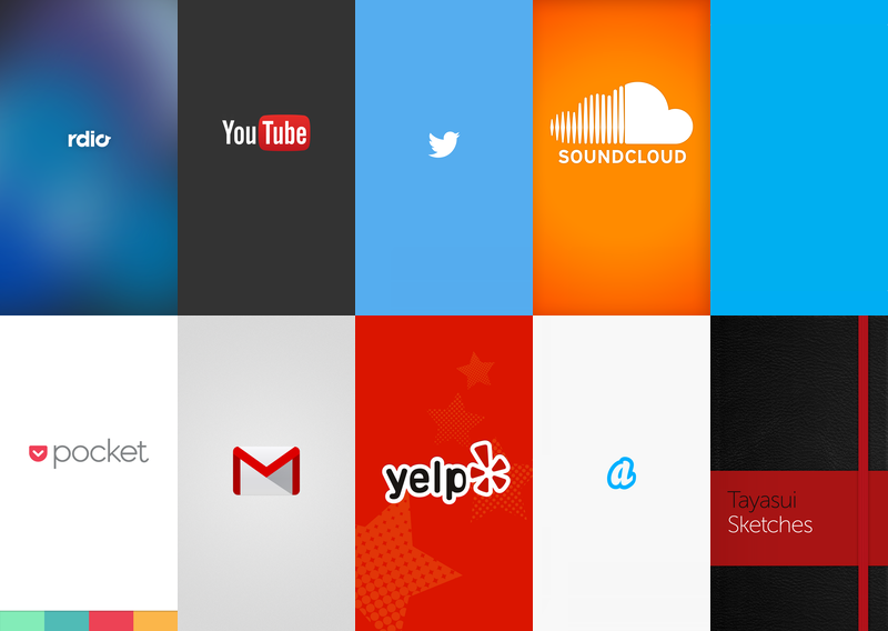
Here’s the current trend – the splash screen:

The design bar seems to be quite low - you can probably just slap your logo up there and call it a day. I’m actually a big fan of going even simpler as in Skype’s minimalistic screen - it’s just solid blue. (No retina version required!)
Longer term, launch time will decrease further and combined with automatic snapshots by the OS (e.g. as seen in the app switcher), we’ll be able to remove the various versions of Default.png from our app bundles.
Permanent link to this post: http://xinsight.ca/blog/launch-images-and-splashscreens/
Older: Implications of Free In-App Purchases
Newer: Calabash Tips
View Comments
Related Posts
- 05 Sep 2015 » Calabash Tips
- 15 Oct 2013 » Implications of Free In-App Purchases
- 04 Feb 2013 » Saving objective-c method calls
